Peakly
A landing page that turns a serious problem into a clear product story, and gives visitors a reason to take action.
Services:
Web Design and developement
Industry:
B2B SaaS supply chain intelegence
Timeline:
2 Weeks

The challenge
Make hiking safer. Make the value clear.
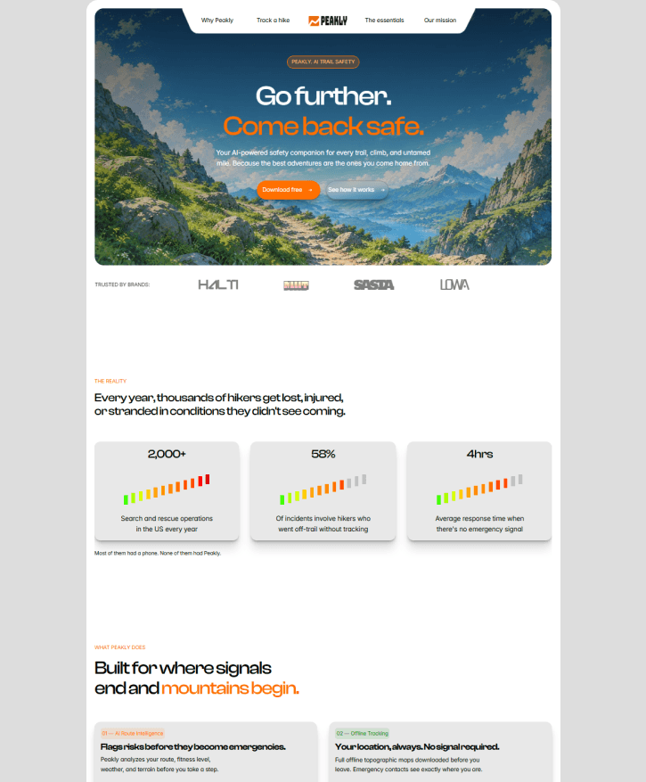
Peakly needed to explain why hiking safety matters, how its AI-powered features help, and why hikers should trust it when heading into the outdoors.
The page had to do more than introduce an app. It needed to make safety feel essential.
The thinking
Lead with the reason. Then show the solution.
I built the page around the questions a hiker would ask:
What could go wrong?
How can Peakly help?
Will it work when I lose signal?
Can I trust it in an emergency?
The page starts with a clear promise, backs it up with the risks hikers face, then introduces Peakly's key features.
Making complixity feel simple
Give visitors a clear next step.
The page is designed to move visitors from curiosity to signup, while making the value of a paid plan easier to understand.
The goal is to attract free users, communicate the value of the $9/month Summit plan, and build enough confidence for hikers to recommend Peakly to people they care about.
The outcome
A landing page concept built around trust, safety, and action.
From the first headline to the final CTA, every section supports one goal: helping hikers understand Peakly's value and take the next step toward safer adventures.
The design supports the intended conversion strategy. Signup, upgrade, and revenue performance would need to be validated with real user and analytics data.


HAVE A PROJECT IN MIND?
Let's build something that works for your business.
Have a website to improve or something new to bring to life? Tell me what you're working on, and let's figure out the right approach.

" height="23.999999618530275px" id="NNVJLUceB" transform="translate(0 0)" width="24.00099999238197px"/></svg>)


" height="24.000999946594234px" id="LhCYqaRwG" transform="translate(0.056 0)" width="23.8879996702075px"/></svg>)
" height="24px" id="QJcd6bDHW" transform="translate(2 0)" width="19.900000000000006px"/></svg>)
" height="23.786000006501293px" id="w0DidnC2N" transform="translate(0 0.107)" width="24px"/></svg>)
